
Try to take a lemon and make an apple.

There’s been an interesting development since this past summer and something we’d like to refer to as a strategic partnership.
See the initial article here:
< link to: I Scream >
Usually we are always talking about a project’s development after the job is done. In this Neurochemical entry we are including you in the step-by-step process of this new business in Astoria, NY (Queens). The name is Sweet Jane’s Frozen Desserts.
1) She had to choose a new name because of a potential trademark infringement. The firm found Sweet Janes, without the apostrophe, is free and clear. This is now the new name.
We won’t go into all the fuss and bother with the all the research we did because most people consider research boring and useless. To those people that undermine the usefulness of painstakingly gathering hard data, we say: “Go to take the Law Society Bar exam or a Board Certified Medical exams WITHOUT RESEARCH and let us know how that works for you.” 😊
2) as of the date of this entry we still haven’t completed all the Branding (Brand-ID) on her campaign yet but have placed a few elements down that work.
3) We are jumping ahead of ourselves on the Brand aspects and looking at the logo Re-design. It’s not a huge mistake skipping this step because we know what we are doing. So, for this Neurochemical excerpt, we’d like to go over the process of redesigning the Sweet Janes logo.
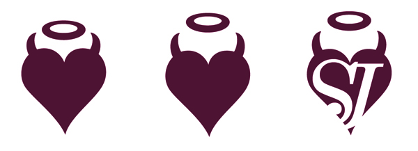
Here’s what the logo looked like two weeks ago. I still say that it is fine.
![]()
Let’s look at this more critically.
The initial designer who did this for Jane wanted to impress the idea of duality:
- The horns and the halo.
The orange and the purple.
The two different fonts of the “S & J”.
Well, this is fine, not great design but for a single shop business, it’s okay. Now if you want this little business to grow into a larger brand (thinking 5-7 years down the road) this is a dismal failure. Let’s make the switch NOW before Sweet Janes gets too far into the public eye.
First, (1) All logos have to work in black and white.
I played with the propositions so when it is either shrunk to a quarter of an inch or blown up into a 30 foot building mural it will still look good and be readable. Now it will read better and be recognizable.
Second (2) I used the measurement in the golden ratio from Pythagoras and moved the halo up higher to achieve this proportion.
Ah, it does look better and feels much lighter. This took me a couple of days. It’s difficult to make something look simple and effortless.
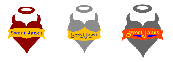
Third (3), I fixed the proportion to make it 100Xs more readable even at a small size:
^ The middle one ^ reads really well. The SJ is proving to be distracting and confuses the reader.
We’ll use the second one.
Next, we’ll play around with the font and place a banner on it. I wanted to make the banner look like a halter top, underwear, some thing sexy, something fun and something, ‘old brand,’ ice creamy.
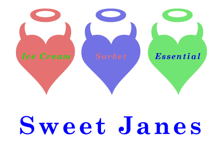
 It’s not looking done yet… How does the logo play out in applying it to a Brand Architecture and can the colors could be used to represent different aspects of the brand?

Meh… I’m not in love with you yet. So I did a few dozen other versions.
Colors that are light like a pastel could work for a high-end ice cream.
It’s still not there. It still needs some….. 🤡 UMPH💥.

Okay… it’ still not there yet so, let’s go back to this earlier rendition, to the solid black and white. Um, maybe, maybe… maybe it has too much boldness for an ice cream brand.
Let’s try for something that might be considered a little more elegant and a little more adult.

Maybe too MANY COLORS now… although removing the banner seemed to add something very cool.
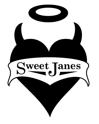
I think this is it.
I don’t usually talk about sales too much but, I’m pretty good at it.
I recently went and showed my face everyday for the last 2 weeks to get Jane and me in front of the GM at the famous Bohemian Beer Garden in Astoria, Queens. They’re only 2 blocks away from Sweet Janes and are celebrating their 100th anniversary this year. On any given weekend this beer garden hosts and serves over 2,000 people.
It will be the biggest and best form of advertising while selling 2-3 times the amount of product. Bohemian Hall will have something new that none of the other beer gardens have featured yet and we all are excited and intrigued.
Something like the logo above will work for this historic venue! We met with the GM today and have come to an agreement for Oktoberfest and their big wine weekend. If you are in the area this weekend, stop by. We’ll be serving wine sorbet and beer pops.
.
We’ll be redoing the interior of the store with the logo and have created the textile below for the walls.
This pattern will be applied with a rubber stamp and ink pad. It’s a low cost solution and there’s something amazing that happens when you look at an entire wall cover with a pattern, not manufactured, but done by hand.

With the right lighting we’ll eventually have a great looking place with this logo as the centerpiece.

If you have any questions about what we are building and how we accomplish this or would like to see how we handle certain aspects in helping clients build an empire, just write us. BinkNyc@gmail.com
