
To Design something is to INTEND it.
Something I rarely talk about in the Neurochemical e-mails is Design. It’s a very important subject and something you are most definitely looking at and using on a daily basis without a critical conscious awareness of it.
The New York Times is an excellent example of design. Even the mere mention of the name carries with it excellence and reliability. It has ‘sourced knowledge,’ good writing, photography, illustration and is viewed as a reputable publication of thorough, trusted and tested information.
The font we use for more serious subject matter at the firm is called Times. That, and the place in NYC with all the Ads in huge lights is called Times Square. Both are named after the newspaper. This is by design.
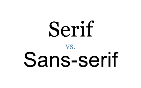
People are creatures of habit so we are used to reading sans serif for headlines and serif type in body copy as we see so common in many books over and over again.
I used to work at the NYTimes, @ their W42nd Street offices doing page layouts on their large screens and super fast computers. They called us “The Design Mercenaries”. We were hired to go in and “kill” the news pages that were running late before press.
I had a beeper and the art director would beep me anytime between the hours of 10pm-2am and I had 30 minutes to get there. The code was #620. I would jump out of bed or pop up from a bar stool or dinner, pay the tab, run out and hail a cab.
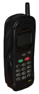
A year later, I was one of those folks with a cellphone (1996). It was $2.49 per minute and had a girth and weight to it, pulling my pants down when I walked because I have no ass shelf.
At the NYT offices, we were given a page or two and have an hour or two to complete the 2-3 layouts. Sometimes this happened until 3am. The pay was $75. an hour, plus travel time, plus cab fare. I happened to be super fast at solving page layout design problems but, specialized at kerning and leading type.
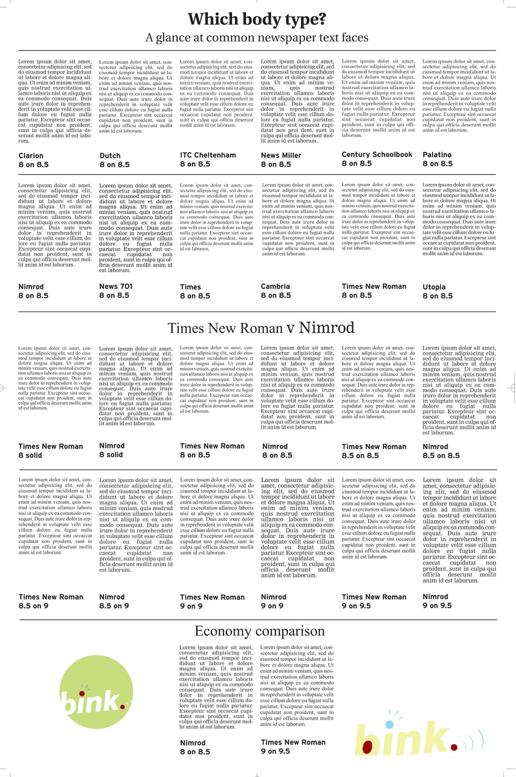
The font point sizes were precisely 9.8 pts. and leading was exactly 12.3. We had some type leeway but, not that much as you can imagine. Sometimes we would have to throw the body copy back to the director and he would send it over to the editor to get rid of 5-10 words from an article to fit on the page.
I don’t know if you’ve ever seen the printing presses under their 42nd Street building but they are solid cast iron and they have become permanent fixtures of Manhattan Island and will never, ever be removed. If you can imagine four USS aircraft carriers standing on their toes, that might give you an idea of how big they are.
Here are some particulars to use and look at on your web page to create “Greater Readability“.
These techniques have become second nature for me after some 20,000 page designs later but, there is always more room for improvement. Here are some basic techniques:
.
People don’t really read anymore according to Slate:
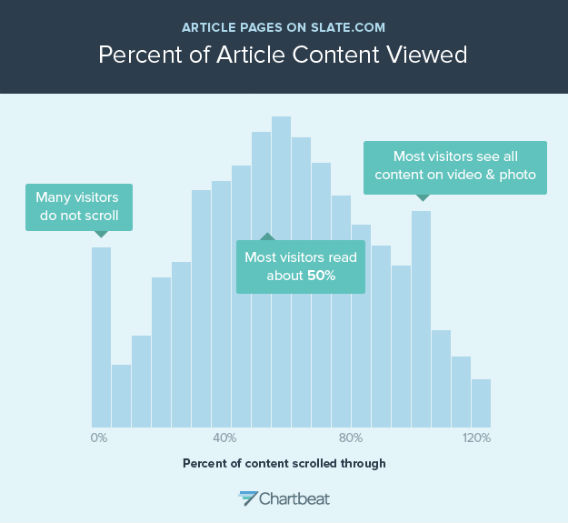
People are now scanning to get some piece of info. You want to be fast in getting that info to them. This is what will bring readers and viewers back to your website time and again: fast, easy-to-read and with good information.
Here are some considerations regarding type:
1. Fonts
.
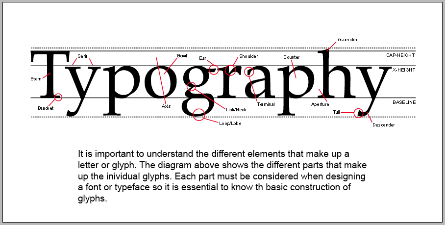
2. Typography Definition
.
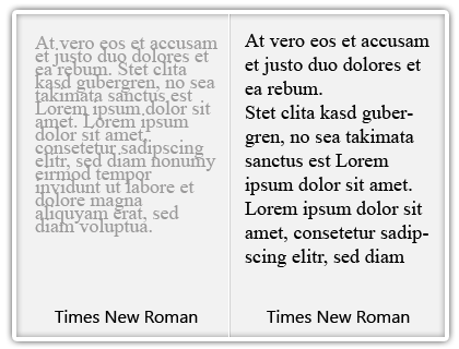
3. White Space
Rule:
Not too much.
Not too little.
.
4. Adding images
Think of type as gray blocks on your website. The color should be balanced and even.
5. Make it UNexpected
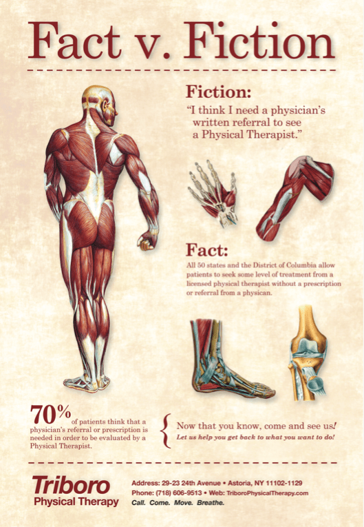
Queens PT

Sweet Janes (Logo & Brand)
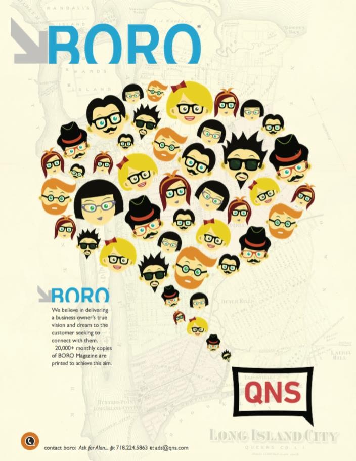
BORO Magazine (Queens)
Think of your page like a painting that you want to look at. Compositionally, you can direct the eye, exactly where you want it to go, by using design devices such as contrast, shape, texture, color and by varying the point sizes. CONTRAST is the first thing people notice.
.
6. People love faces
.
People look at pictures of faces as they size it up and make snap judgements immediately: smart, cute, sexy, nice, mean, trustworthy, etc… Despite the old adage “Never judge a book by its cover”, we do it all the time.
A picture really does say 1000 words.
Finally, the writing has to be good and engaging, however, this is fodder for a different e-mail or page entry. Ideally, it starts from the headline, continues into the first sentence and concludes all the way to the last period.
.
.
I hope this was very helpful. Thanks for visiting. There’s much more to come…
If you want to get on the Neurochemical e-mail list, kindly write “Get me on this amazing list, you crazy ass freak.” Then, just send this message to: BinkNyc@gmail.com
.
 Neurochemical Publicity in the Aquarian Age.
.
.


 < Let’s connect.
.
.
.
